Brand Assets
Decoding Ai 4 Business
Decoding Ai 4 Business

Logos
Place these masters. Never re-type the wordmark — the letter spacing, the lining 4 and the Q swash are set, not typed. Keep one cap-height of clear space on all sides.
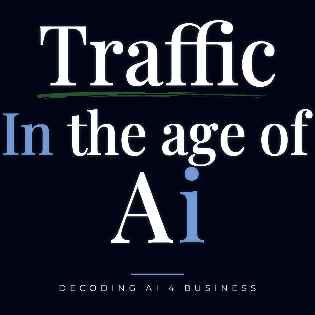
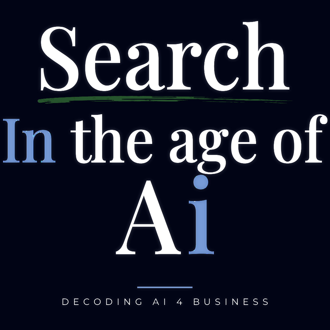
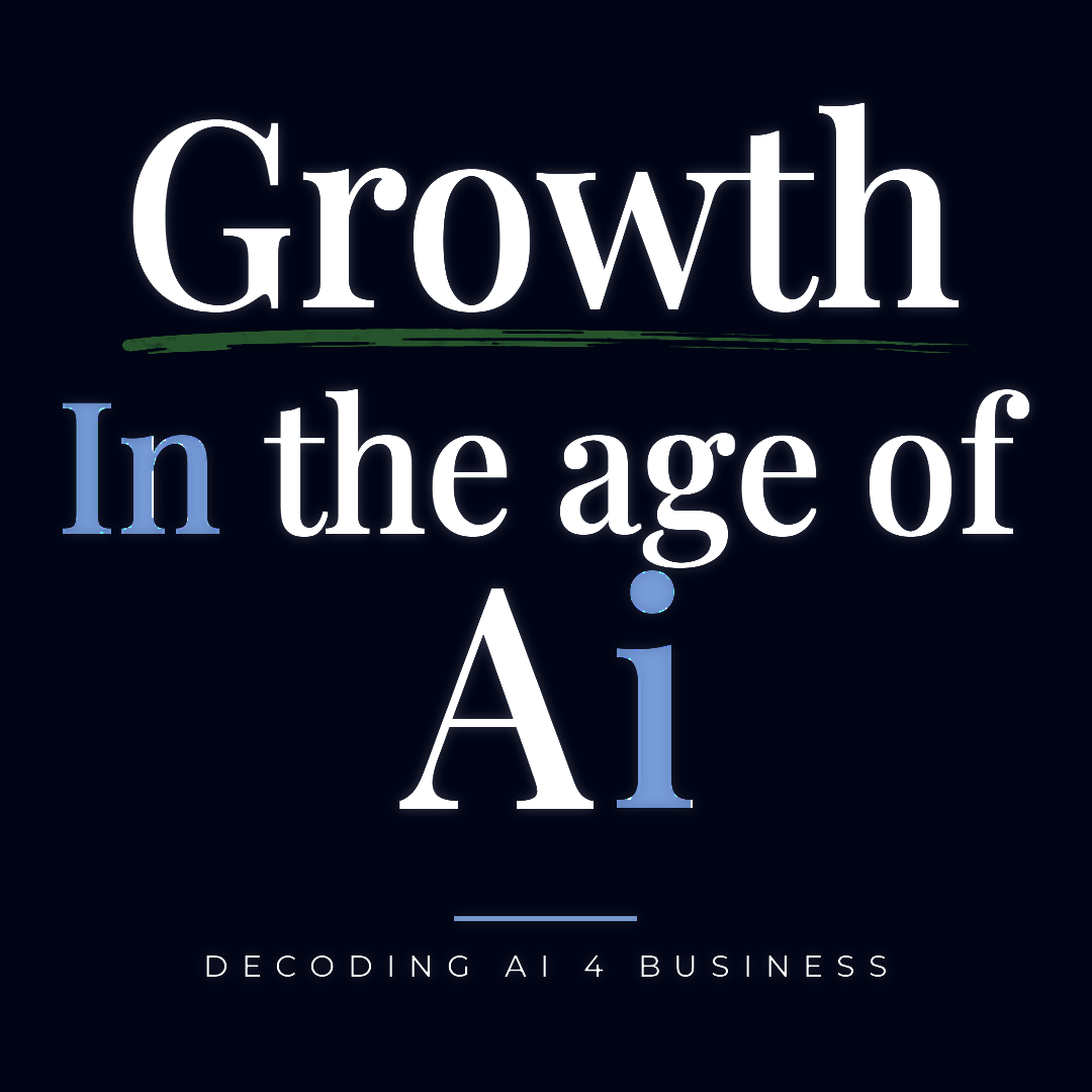
Editorial series
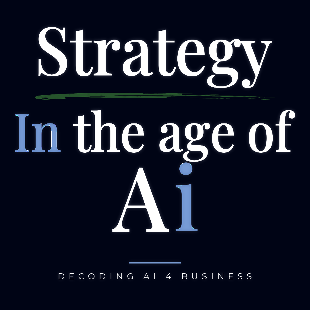
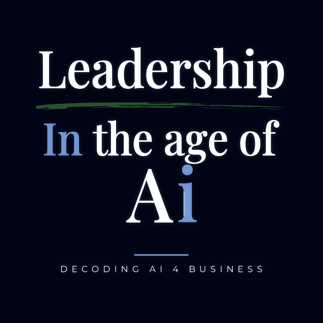
One template, one variable. Every image below is generated from the same rules — the headword changes, nothing else does. New words join the series without redrawing anything.
Assets
The brush strokes are captured, not drawn — reuse the file, never redraw the gesture. Green sits under editorial headwords; blue belongs to wordmark contexts.
Every lowercase i is blue. The 4 is always green. Everything else is white — the Q included. Backgrounds stay ink.
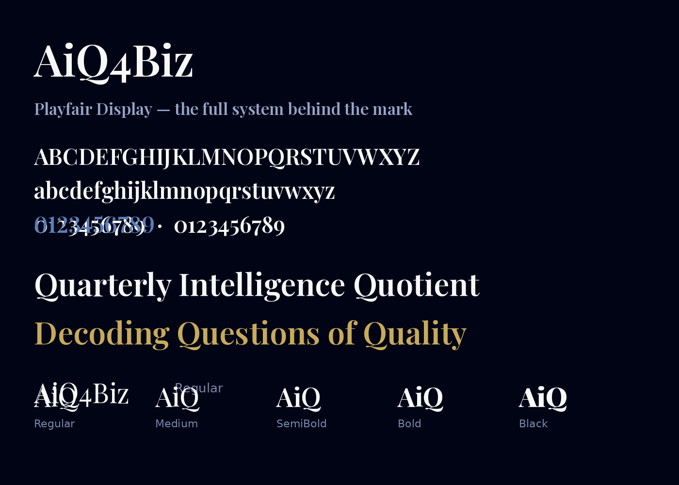
Playfair Display SemiBold carries the mark, Medium carries editorial headwords. Montserrat sets taglines in tracked caps. Lining figures always — old-style numerals drop below the baseline and break the lockup.
Letters hold a uniform ink gap of 9.5% of cap height; the i-to-Q join takes 1.55× that, so the i reads as the pivot of both Ai and iQ. Between elements, spacing is deliberate rather than even — what belongs together, touches.